

NY Nobody Knows
Series Cover and Interior Design
In 2016, I was assigned the task of designing a book series of off-the-grid, urban walking guides through the five boroughs of New York. Written by sociologist William B. Helmreich, this new series stemmed from his best-selling book, The New York Nobody Knows and offers the readers a personal, off-the-beaten-track journey through each borough, educating them about the history and people he meets along the way.
The challenge: create a consistent series design for five books about five very different and equally compelling New York boroughs, all while standing out from the typical, cliche tourist books in the genre.
Color

We knew from the start of the project that we wanted a different color for each borough. This idea eventually led to printing the interior in two colors, black and a Pantone. This also gave us the opportunity to further stand out from the other tourist/city guide books and print the images as duotones. These factors ended up influencing the final color choice for the covers and resulted in a darker, more earthy color palette that still felt appropriate for the subject.
Typography

Five consecutive volumes were planned: Brooklyn, Manhattan, Bronx, Queens, and Staten Island. I first explored a type-only direction, inspired by the typography from the cover of The New York Nobody Knows and various street and store signage found in New York. This lead me down the path of older typeface designs, specifically wood type specimens, and eventually to the collection of Hamilton Wood Type. Since there was so much character packed into each typeface, I assigned a typeface to each borough.
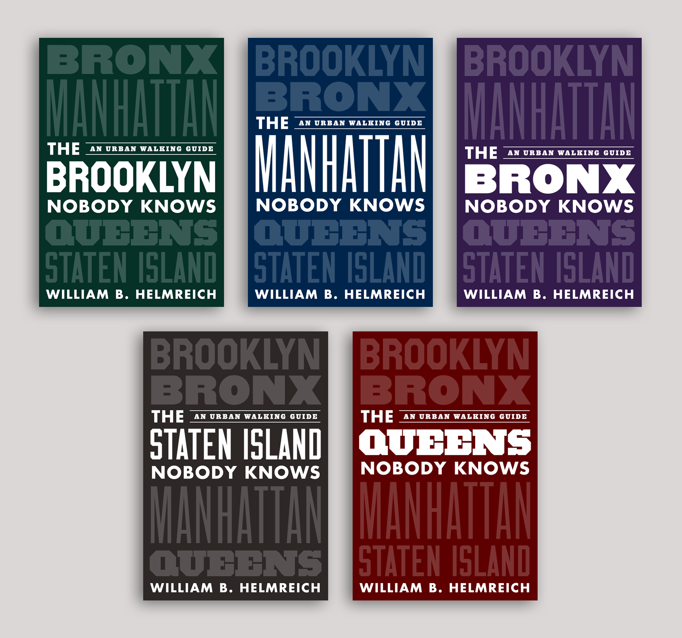
Unused cover direction
The first direction involved stacking the boroughs on top of each other and adjusting the lockup for each book. Unfortunately, while everyone understood the appeal of type-only covers, the in-house team agreed they missed the photographic component, which gave it a human touch.
We decided to team up with talented photographer Antony Bennett, who shot the cover photo for the New York Nobody Knows (NYNK) and worked directly with the author to photograph the interior. His photos were often taken with overcast skies, giving everything a gray backdrop that had the perfect balance of grit and mystery. For the layout, I used a similar banner from the NYNK cover and placed it in the center, giving us the chance to use two images for each cover. This resulted in the final cover, below:

Final cover design for The Brooklyn Nobody Knows.

A sample of the interior design spreads. Each borough opened with a map (outsourced to a map designer). The book was set in Adobe Caslon Pro with Futura for the secondary display items.