

Music Matters
Series Logo and Cover Design
I was approached by Art Director Dustin Kilgore at The University of Texas Press to design a book cover series and accompanying logo for a project that just landed on their desk (and was due to print in just a few weeks). The series, Music Matters, is a collection of books arguing the importance of individual bands and musicians, each written by noteworthy writers.
The goal of the project was to create eye-catching book covers that could easily fit different names and artists with the addition of each new book. One of the challenges of the series design was to not exclude any diehard fans of a specific musician from buying just one book from the series. Each book would need to be able to stand on its own as an attractive cover design.
Research

I began by researching books in the music genre including general music and specific biographies. I noticed a trend of condensed sans serifs, large imagery and low-key color palettes restricted to 1 or 2 colors. Black and white photography was extremely popular and we wanted to avoid this.

Research into other music series.
Logo

Preliminary sketches of logo ideas and how the logo could be integrated into the cover design. My goal was to create a typographic mark that could be used by itself and still be recognizable as part of the series.

The chosen logo with Pitch by Klim Type Foundry as the accompanying typeface.
series cover design

The final series design. Knockout was successful in allowing multiple artists at varying name lengths to fit on the cover comfortably and have the covers still look strong on their own. The contemporary color palette of two colors gives the series the flexibility to create unique color combinations for each artist.

Final design of back cover and spine treatment.
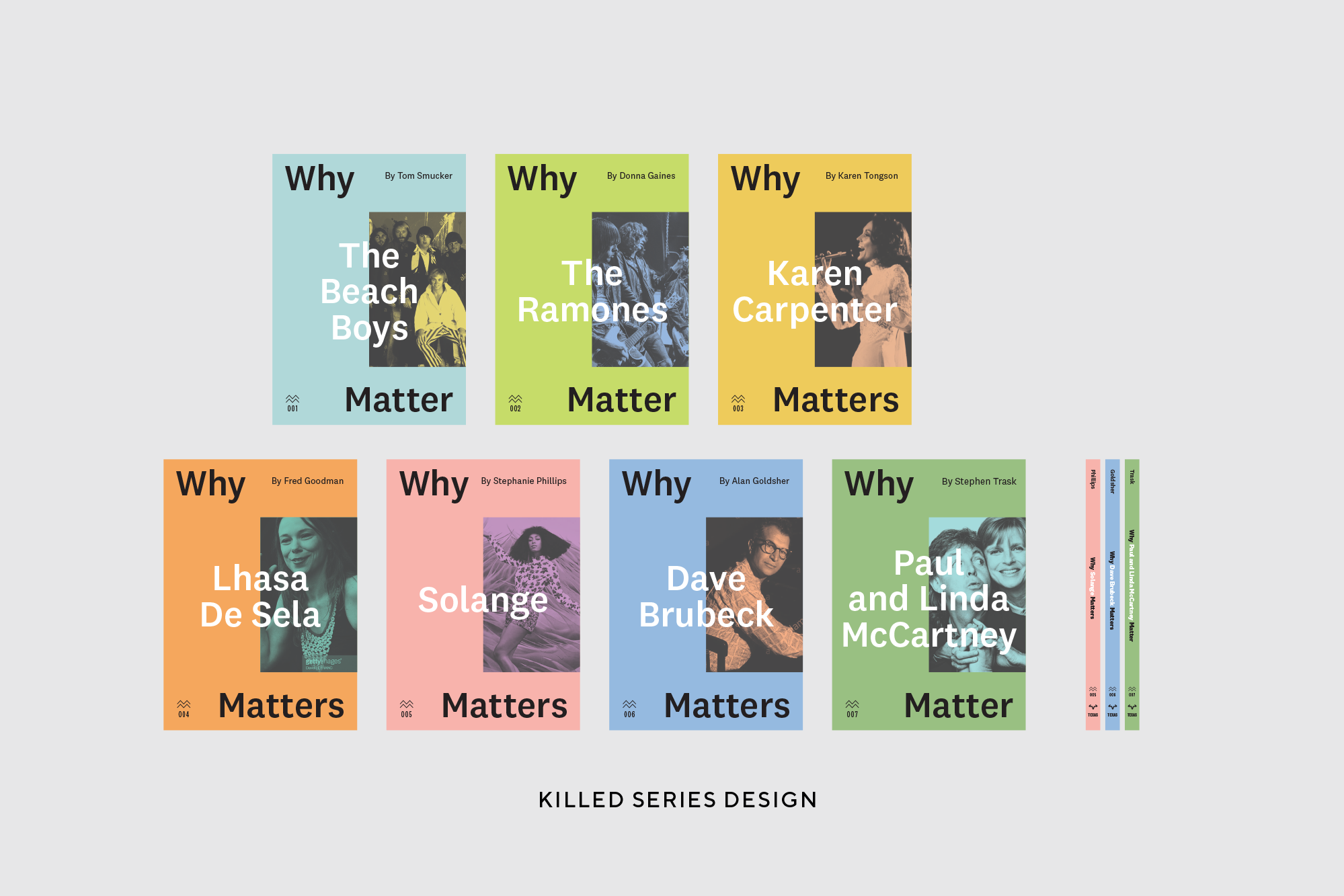
Alternative killed direction using the typeface National (Klim) and an alternative logo treatment.

Alternative killed direction featuring different weights of Knockout and no official logo.